After 3,240 days, I figured it was a good time for a good refresh. It was March 19, 2013 when I last did a significant user experience (UX) refresh to my site.
Back then, just over 1.5 months shy of 9 years ago, I relaunched the site not just with a new UX theme, but I re-platformed from a small open-source engine (.TEXT & SubText) to a more popular open-source CMS engine (Orchard).
Then, about 3 years ago in August 2019, I switched from Orchard to Hugo, a static site generator. At that time, I kept the theme so the changes were just under the covers. But ever since that move to Hugo, I’ve wanted to refresh the UX of my site. Because the “work” projects always take up the most time, I kept putting it off. But if you’ve noticed over the last few months, I’ve been giving my site a lot more attention.
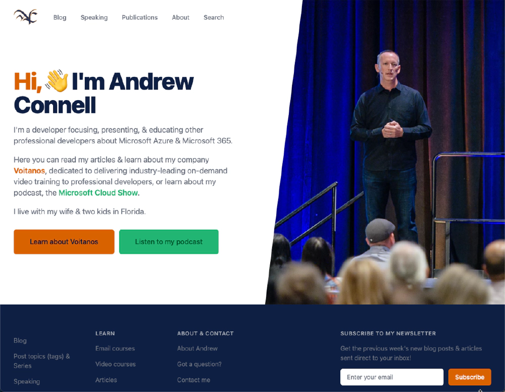
Over the last week, I took advantage of a little scheduled downtime to knock out the UX of the site. You’ll notice it looks very similar in many ways to my company site, voitanos.io. That’s intentional - I was sick of one site using one CSS framework (this site used Bootstrap) and different customizations than my company site. But now, they’re unified, and while it’s only been a few days, I’m loving it. In fact, I’m kicking myself for taking so long to do it after seeing how quickly I was able to knock it out.

New AndrewConnell.com homepage
I’ve come a long way with this site, since my very first post on September 2003. I consider this to be the fifth (5) version of the site:
- v1 - September 2003: .Text
- v2 - May 2005: SubText, Azure
- v3 - March 2013: Orchard, Azure & Bootstrap
- v4 - August 2019: Hugo, Azure & Bootstrap
- v5 - January 2021: Hugo, Azure & Tailwind
In this post, I’ll explain a bit more about the process.
Why do it?
I touched on a this question some in the introduction above 👆
While I was tired of the old look (it’s almost 9 years old!), I had some tangible reasons to do this. I publish content on a few different sites. From my podcast, the Microsoft Cloud Show, to my education business, Voitanos, when you’re jumping between platforms, it’s quite a context switch when the process is a little different on each one.
The UX elements used for things like callouts, quotes, and things like that were different across the two primary sites where I write (this one & the Voitanos’ blog). This was made even more challenging because this site used the CSS library Bootstrap while Voitanos uses Tailwind CSS.
My life would be so much easier if I could standardize things across sites and use the same controls:
And quotes like this! Tailwind CSS rocks!
My site also was in desperate need of some SEO love. The person I had help with the theme 9 years ago didn’t design with SEO in mind. Couple that with changes in the industry and Google’s search engine, and my poor site was way out of being current. I felt like I was strolling down the street with a pager, not a mobile phone!
Tailwind CSS & Tailwind UI to the rescue
A few years ago, when I relaunched the Voitanos site, I decided to use Tailwind. I already had a commercial license for Tailwind UI:
Tailwind UI is a collection of beautiful, fully responsive UI components, designed and developed by us, the creators of Tailwind CSS. It’s got hundreds of ready-to-use examples to choose from, and is guaranteed to help you find the perfect starting point for what you want to build. Over 500+ professionally designed, fully responsive, expertly crafted component examples you can drop into your Tailwind projects and customize to your heart’s content.
I intentionally reused a lot of the page layouts and controls from the Voitanos theme I created for AndrewConnell.com. In fact, I created a few new ones for this site that I’m going to migrate over to the Voitanos site in due time.

Recent blog post on AndrewConnell.com, with the new theme
Recent blog post on AndrewConnell.com, with the new theme
You’ll notice how the above page looks very similar to blog posts on the Voitanos site. In fact, the rollup pages for the two blogs, AndrewConnell.com/blog & Voitanos.io/blog, look almost identical.
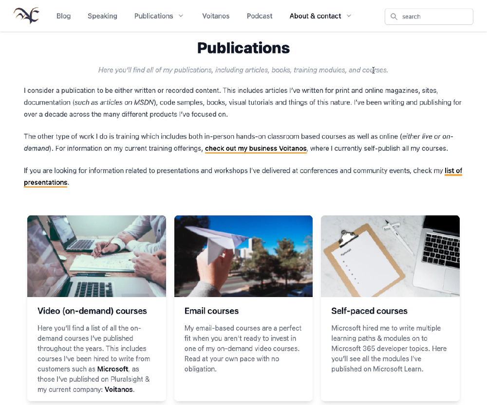
I also did some content work and resurrected a section I used to have on my old site. Now, there’s a dedicated section for my publications, categorized by the type of publication. This section includes courses and articles I’ve written, recorded, and delivered over the years:

List rollup pages
View all my publications in the new /publications section
SEO optimizations
Another big reason I updated the theme was to implement a lot of performance, usability, and search engine optimization (SEO) optimizations across the site. This includes a more mobile-friendly site.
Content is a huge part of this, and that’s where I have a lot of issues for organic search optimizations. A service I use to help identify these issues has been very useful on the Voitanos site, and I’m using it on this site as well. I’ve got a huge backlog of items to knock out. If you see something that stands out, please let me know!
Ongoing work
As much as I’d love to say “the site is done!”, it isn’t. I’ve got a lot of content work to do. I’m moving internal image and link references around. Hugo has some great features to ensure you don’t have broken internal links & image optimization controls.
Since I started writing back in September 2003, I’ve had the attitude that I shouldn’t delete old content. However, I’ve changed that mindset and plan to retire stuff that’s either grossly outdated and irrelevant, or things that just don’t make sense to leave around. I’m not talking about reference or useful resources… I’m only planning to retire things that have no value today like product.
Conclusion
That’s about it for now. If you have a question, or see something that’s broken or a little off, feel free to contact me either via my contact page, or dropping a tweet using the controls below 👇