In SharePoint 2007 many customers provided lots of feedback to Microsoft… ok, they complained… that the markup generated by SharePoint 2007 (which also meant WSS 3.0 and ASP.NET 2.0) was not clean, concise or friendly to accessibility requirements.
What’s new in the SharePoint 2010 generated markup story
Microsoft heard this loud and clear and committed to have SharePoint 2010 generate WCAG 2.0 AA complaint markup. However you may seen or heard in various places, even from a Microsoft person, in a blog or in some news report, that SharePoint is also generating XHTML 2.0 Strict markup… that is not true. The product team has not committed to that and in my opinion people seem to be getting a bit too carried away. This is usually the result of folks who seem to be inferring what WCAG 2.0 AA is (frankly… as we’ve all seen, there’s a lot of misunderstanding about what an accessible site really is). There are and will be a few extra attributes that Microsoft added to the markup which would not conform to the strict rules. Regardless, the most important thing here is WCAG 2.0 AA support which covers a very big spectrum of accessibility guidelines and requirements.
One of the most common complaints I saw was the the OOTB controls, like the ASP.NET menu control, generated HTML TABLE based markup. What people really wanted was a more CSS friendly rendering (as tables are supposed to used only when presenting data in a tabular form, not in controlling the presentation). One way around this was to use control adapters, something Randy Drisgill talked a good bit about. This was also the approach of the Accessibility Kit for SharePoint which basically swapped out the default rendering with CSS friendly renderings.
Let’s see the difference
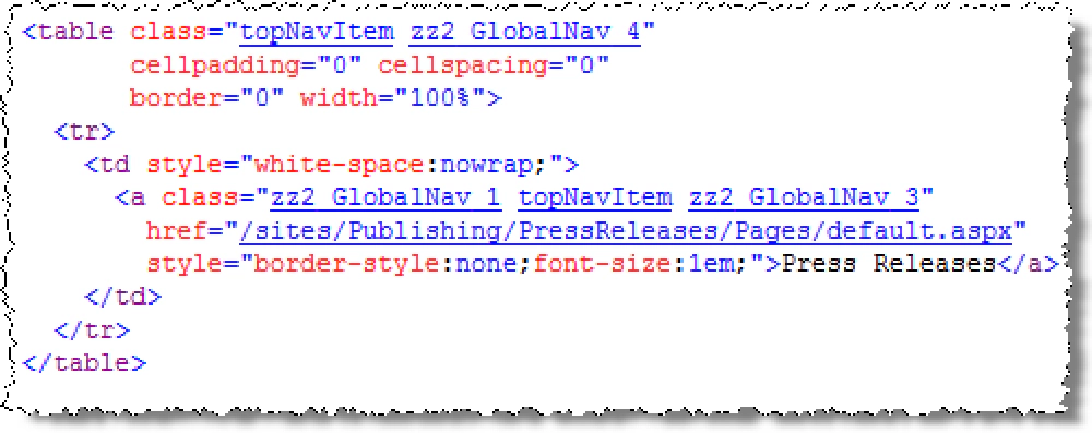
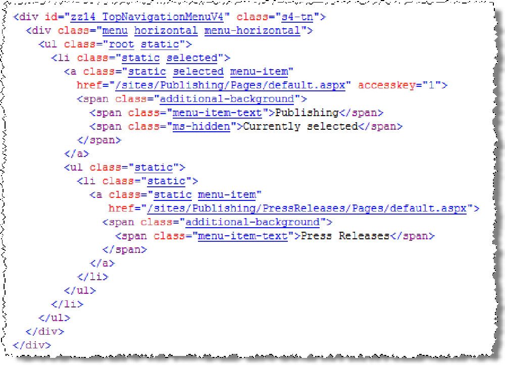
Thankfully Microsoft has changed the rendering of the controls in SharePoint 2010 right out-of-the-box (OOTB) so we don’t have extra work to do! Check out this sample rendering… I took an OOTB Publishing site from SharePoint 2007 and saved the rendered page as raw HTML. Then, I backed up the site, restored it in SharePoint 2010 and upgraded the visuals to the new 2010 UI. Then I saved the rendered results as a raw HTML file. One big thing to take note of: I didn’t do anything to the markup, I just upgraded the site and then told SharePoint to use the new 2010 rendering instead of the 2007 rendering. Taking these two HTML files, one with a 2007 rendering and one with a 2010 rendering, I looked for the global navigation. Check out what I found…
Here’s what the global navigation looks like in SharePoint 2007:

Global navigation in SharePoint 2007
That’s clearly table based rendering… the CSS and accessibility purists are saying “yuk… I’ve worked so hard in 2007 to mitigate that rendering, why show it again?!”
Now check out what it looks like in SharePoint 2010 after you tell the site collection to use the 2010 rendering (aka: upgrade the visuals):

Global navigation in SharePoint 2010
While there’s a bit more markup, there are no tables… all unordered lists which are much easier to deal with on accessible sites and with custom branded sites! Keep in mind the coolest part about this: I didn’t touch the markup at all in the page layout or master page… I just clicked the magic button that said “use the 2010 rendering and visuals, not the 2007 ones.” I love magic buttons…
One more thing
In the previous post and in my SharePoint Conference session, I said the following (paraphrased): when you upgrade to 2010 and upgrade the visuals, your site will still just work. That’s not entirely true in all cases. As you can see from these rendering changes above, you could very easily have some rendering nuances as the underlying markup your branding was written to may have changed with this new markup rendering from some controls you were leveraging… so there may be a bit of extra cleanup.